The fastest way to fix a LinkedIn banner is a centred, one-line value statement or a profession-relevant image sized at exactly 1584 × 396 pixels, placed inside the centre safe zone so nothing gets cropped on mobile. That single move puts you ahead of most profiles on the platform. The section below walks through role-specific banner ideas, the exact specs, and the fastest tools to build one properly.
TL;DR:
- Centered, one-line value statements or profession-relevant images sized at 1584 × 396 pixels are the fastest way to create an effective LinkedIn banner.
- Keep key elements within the centre safe zone, roughly 60% of the width, to ensure they are visible on mobile devices.
- Using templates can produce a professional banner in minutes, but strategic messaging tailored to your role and career level often requires custom design.
- A coordinated profile, including banner, headshot, and resume, improves response rates for senior candidates in competitive searches.
- Avoid clutter, multiple messages, or placing important content near the bottom-left corner, where profile photos will cover your banner on all devices.
Table of Contents
- LinkedIn banner ideas by role and purpose
- LinkedIn banner dimensions, safe zones, and export rules
- Tools and templates that build a banner in minutes
- When a profile specialist is worth the investment
- How to build a LinkedIn banner from scratch
- What actually moves the needle on a LinkedIn banner
- Our packages for a coordinated LinkedIn profile
- Sources
- FAQ
LinkedIn banner ideas by role and purpose
Most professionals still use the plain blue default background, which means a personalized banner is an easy way to stand out, according to Adobe’s LinkedIn cover photo guide. You do not need a designer to get there. You need one clear idea, executed cleanly, that matches the role you are trying to land or the authority you are trying to project.
A strong LinkedIn banner communicates your role or value proposition at a glance, and every idea below is built around that principle rather than decoration for its own sake. Here are the five concepts worth building from.
- Brand and identity banners. A solid brand colour with one line of text (your title, your specialty, or your positioning statement) works especially well for consultants and freelancers who need instant clarity on what they do. Keep the type large enough to read at thumbnail size and stick to a single font weight.
- Credibility banners. Client logos or a compact results stat (think “12 years in supply chain leadership” rather than a paragraph) suit consultants and senior hires who need to establish authority fast. Keep logos tasteful, sized evenly, and only use ones you have permission to display.
- Portfolio or showcase banners. A product shot, app screenshot, or a strip of portfolio thumbnails works well for creators, designers, and product managers whose work speaks louder than a job title. If you write for a living or build creative campaigns, a marketing-focused resume approach applies the same logic to your banner: show, don’t just tell.
- Human or behind-the-scenes banners. A photo of your workspace, a conference stage, or your team in action humanizes creative and operations roles where personality is part of the pitch. This works best when the image is bright, uncluttered, and does not compete visually with your headshot.
- Minimalist banners. Abstract shapes, subtle gradients, or a soft texture that echoes the colour of your headshot background are the fastest to produce and the safest option for active job seekers who want polish without risk. This is often the best LinkedIn banner idea for job seekers who need something professional up within the hour.
Every one of these ideas depends on the same discipline: keep key elements inside the centre safe zone so they survive mobile cropping and don’t get covered by your profile photo.
Pro Tip: Pick one message per banner. A results stat, a value statement, and a product shot all crammed onto one background will read as noise. Choose the single idea that matches what you want a recruiter to think in the first two seconds.
LinkedIn banner dimensions, safe zones, and export rules
Design at exactly 1584 × 396 pixels, a 4:1 ratio, and export as a high-quality JPG or PNG under 8MB. This is LinkedIn’s recommended cover photo size, and going smaller risks pixelation while going larger risks an awkward crop.
The part most people get wrong is the safe zone. Keep your primary text and logos inside the centre roughly 60% of the width, since practitioners consistently recommend this range for legibility across devices. Avoid the bottom-left corner entirely. That’s where your profile photo sits, and anything placed there gets covered the moment someone views your profile.
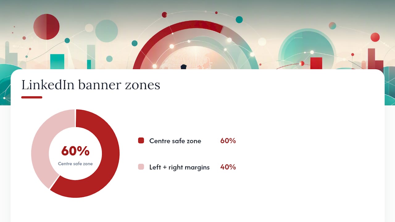
A simple three-zone layout keeps this manageable: left stays clear for the photo overlap, the centre carries your one message, and the right holds a logo or a secondary detail like a website or tagline. This composition rule shows up across most professional LinkedIn designs because it solves the profile-photo problem without you having to think about it every time.
Before you upload, run through this checklist:
- Confirm the canvas is 1584 × 396 px.
- Check that all text and logos sit within the centre safe zone.
- Preview the design on a mobile screen, since LinkedIn crops more aggressively there.
- Check contrast between text and background at thumbnail size.
- Export at 2× resolution for retina displays, then confirm the file is under 8MB.
Skipping the mobile preview step is the single most common reason a banner looks fine on desktop and broken on a phone.
Tools and templates that build a banner in minutes
You don’t need Photoshop skills to get this right. Template galleries built specifically for LinkedIn banners come pre-sized at 1584 × 396 px, which removes the most common technical mistake before you even start designing. Swap the image, change the headline, and export.
- Use a template editor when you need a simple value-statement banner or a quick photo edit and want it done inside 15 minutes.
- Hire a professional when the stakes are higher: executive branding, a coordinated headshot-and-banner session, or a competitive search where visual consistency across your whole profile matters.
- Before committing to any template, confirm it follows safe-zone guidance, exports at full resolution, and carries a licence that covers commercial or professional use.
Coordinating your banner and headshot into a single visual set is worth the extra ten minutes, especially when using platforms like Facet Cloud to manage creative assets and brand consistency across profiles. It reads as intentional rather than assembled.
When a profile specialist is worth the investment
Executives, career changers, and anyone running a competitive search benefit most from having a professional coordinate their entire visual profile rather than patching it together piecemeal. A banner that clashes with your headshot, or a value statement that contradicts your resume’s positioning, undercuts the polish you’re trying to project.
Custom banners can be built as part of full LinkedIn profile optimization, working through consultations and revisions until the visual identity matches the career narrative in your resume and cover letter. For senior candidates, this often means direct coordination with executive personal branding work so the banner, headshot, and resume tell one consistent story rather than three disconnected ones.
Clients who invest in a coordinated visual profile alongside a rewritten resume typically report a stronger response rate from recruiters and hiring managers, particularly in competitive, senior-level searches.
- Customized banner design matched to your industry and career level
- Multiple revision rounds until the visual and written narrative align
- Direct consultation rather than a template dropped into your profile
How to build a LinkedIn banner from scratch
Start with the message, not the image. Decide on the one thing you want a viewer to know in two seconds: your specialty, your current role, or a single proof point. Everything else in the design serves that one sentence.
Open a canvas at 1584 × 396 pixels and block out your three zones before adding any content. Leave the left third loose since your profile photo sits on top of it. Put your primary message, whether that’s text or a focal image, dead centre. Reserve the right third for a secondary element: a logo, a tagline, or simply negative space if the centre message is strong enough to stand alone.
Balance matters more than decoration. A banner with one bold sentence and generous white space reads as confident. A banner packed with a headline, three bullet points, and a logo reads as cluttered, and clutter is the fastest way to lose the two seconds you have. If you’re using a photo as your focal point, make sure the subject or object sits in the centre third, not tucked into a corner where it competes with your profile photo or gets clipped on mobile.
Finish by checking contrast: light text needs a dark background behind it, and vice versa. Export at 2× resolution, upload, and view your live profile on both desktop and mobile before you consider it done.
What actually moves the needle on a LinkedIn banner
The conventional advice on LinkedIn banners spends too much time on aesthetics and not enough on function. A gorgeous gradient means nothing if your one-line value statement sits in the bottom-left corner where your photo covers it. The research is consistent on this point: a single clear message, placed inside the centre safe zone, outperforms a beautifully designed banner that tries to say three things at once.
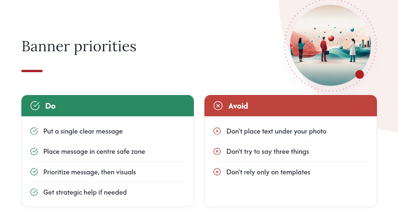
What’s underrated is how little effort separates a default blue background from a polished profile. Most people never touch this asset at all, so even a modest, well-placed value statement puts you ahead of the majority of profiles a recruiter scrolls past. Prioritize the message and the safe zone first. Worry about visual flourish only after those two fundamentals are locked down.
Where I’d push back on the “just use a template” crowd: templates solve the technical problem, not the strategic one. Knowing what your banner should say about your career, especially at the executive level, takes more thought than a five-minute swap job. That’s the piece worth getting help with.
— Professional
Our packages for a coordinated LinkedIn profile
Choosing the right message for your banner gets easier when it’s built alongside your resume rather than as an afterthought. Banners can be designed as part of full profile optimization, so your visual identity, resume language, and LinkedIn presence all point in the same direction.
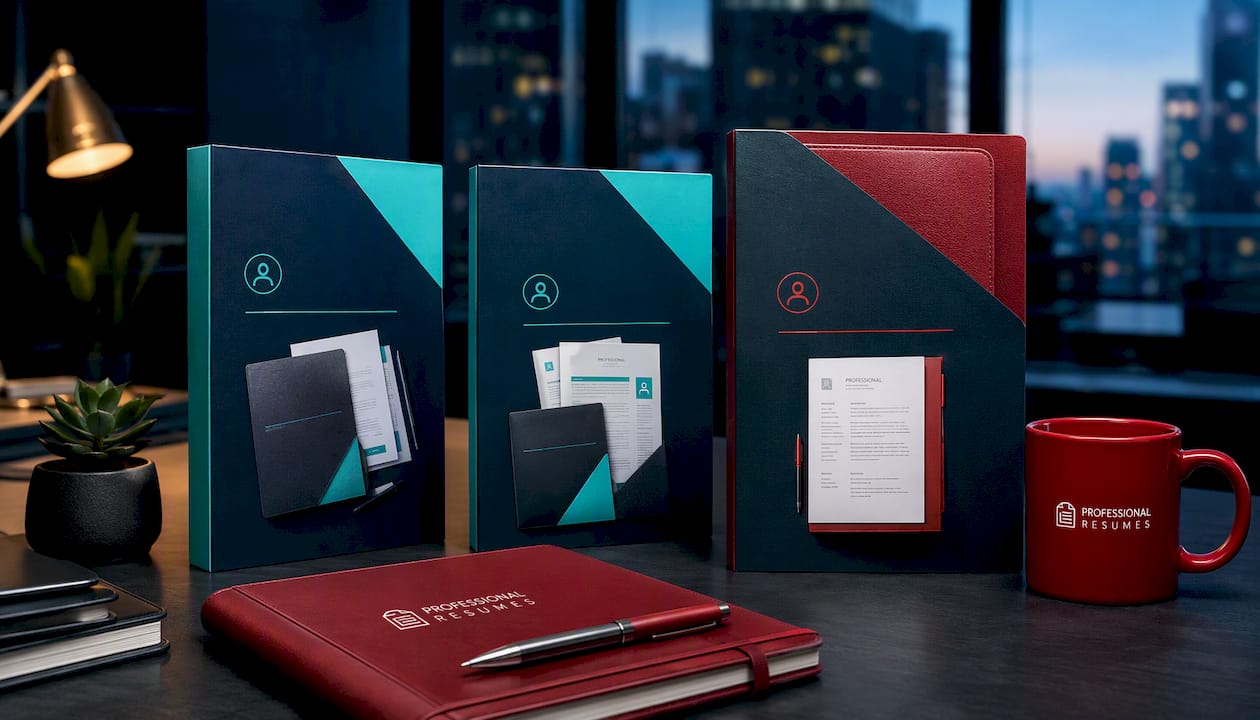
The Executive Package Deal suits senior leaders who need a resume, cover letter, and LinkedIn profile, including a custom banner, all coordinated around one leadership narrative. The Early Career Package Deal is built for job seekers earlier in their careers who need a quick, professional profile refresh with practical banner guidance rather than a full rebuild. And for candidates who need a ground-up rewrite with visual coordination, the Executive Resume product pairs a fully rewritten resume with a matched LinkedIn visual package, including banner and headshot alignment.
Browse the package pages to see what’s included, or book a consultation to talk through which option fits your search.
Sources
- 17 LinkedIn banner ideas and examples
- LinkedIn cover photo ideas: 10 ways to stand out and build your personal brand
FAQ
What is an appropriate banner for LinkedIn?
An appropriate banner is one that reflects your professional role or industry, uses a single clear message, and avoids clutter or unrelated imagery. A brand colour with a one-line value statement, or a clean profession-relevant photo, both work well as long as key content stays inside the centre safe zone.
How do I create a unique LinkedIn banner?
Start with one message that sets you apart, such as a specific result, a specialty, or your current focus, then build the design around it using a template or simple editor. Coordinating the banner’s colours and tone with your headshot, as Adobe recommends, makes the whole profile read as one deliberate visual set rather than two mismatched images.
What should I avoid in a LinkedIn banner?
Avoid placing text or logos in the bottom-left corner, since your profile photo covers that area on both desktop and mobile. Also avoid low-resolution images, more than one competing message, and cluttered layouts that make the banner hard to read at a glance.
What is the recommended size for LinkedIn banners?
LinkedIn’s recommended cover photo size is 1584 × 396 pixels, a 4:1 ratio, exported as a high-quality JPG or PNG. Preview the design on mobile before uploading, since LinkedIn crops the outer edges more aggressively on smaller screens.
Should I hire someone to design my LinkedIn banner?
A template works fine for a simple value-statement banner or a quick photo edit. For executive branding or a competitive job search, professional coordination through a service like Professionalresumes ensures the banner, headshot, and resume all align around one consistent career narrative.