
Calibri remains the safest default for most job applications and has been tested to parse cleanly across major applicant tracking systems. If you want a serif alternative, Georgia or Cambria hold up just as well, and Garamond suits dense, text-heavy resumes. Set your body copy, export to PDF, then confirm the text still copies and pastes cleanly before you submit anything.
TL;DR:
- Calibri remains the safest, most compatible font for ATS parsing across major platforms like Workday and Greenhouse.
- Serif fonts such as Georgia and Cambria suit specific fields like law or finance, with Georgia providing good readability at small sizes.
- Using standard, system-installed fonts and exporting resumes as PDFs with embedded fonts reduces parsing issues and character corruption.
- Font choice should prioritize readability, space efficiency, and matching industry expectations over personal style or uniqueness.
- Testing exported PDFs by copying text back out is essential to ensure the font renders correctly and the document will parse properly.
Table of Contents
- Best resume fonts: a shortlist and when to use each
- How to choose a resume font for your job and seniority
- Font sizes, spacing and layout rules to copy
- ATS compatibility, PDF export and font embedding risks
- Fonts to avoid and layout mistakes that hurt readability
- How Professionalresumes applies font choice and ATS testing for clients
- What most resume advice gets backwards about fonts
- Get your resume font and formatting handled by a professional writer
- Sources
Best resume fonts: a shortlist and when to use each
Font choice affects two separate readers: the applicant tracking system that scans your resume first, and the hiring manager who reads it second. A font that fails either test costs you an interview before your experience gets a fair look. The following fonts have been tested for ATS compatibility and hold up under both kinds of scrutiny.
- Calibri — the strongest all-around choice. Clean, modern, bundled with every version of Word, and it parses without issue on Workday, Greenhouse, and similar platforms. Use a clear and readable size for body text with a larger size for your name to ensure visibility.
- Georgia — a serif built for screens, not print. It reads comfortably at smaller sizes and suits candidates in law, education, or academia who want a traditional feel without looking dated.
- Cambria — Microsoft Typography designed it specifically for on-screen reading, and it handles technical content and numeric tables well, which makes it a solid fit for finance or engineering resumes.
- Arial — the safest neutral sans serif. Slightly plainer than Calibri, but universally available and never a parsing risk.
- Garamond — a narrower serif that lets you fit more content into the same space, useful for candidates with 15+ years of experience trying to hold a resume to two pages.
- Source Sans Pro — a designer-friendly open sans available through Google Fonts, well suited to marketing, design, or product roles where a slightly more contemporary look works in your favour.
- Helvetica — a classic, high-legibility sans that Jobscan’s testing confirms parses reliably, though it’s more common on Mac systems than Windows.
- Verdana — wider letter spacing than Arial, which helps readability at small sizes but eats more horizontal space, so it works best for shorter resumes.
- Montserrat — a geometric sans Microsoft now recommends for candidates in creative or startup environments who want something with more personality than Calibri.
- Roboto — Google’s system font, widely available and a natural pick if your resume lives primarily in Google Docs.
Aptos, Microsoft’s newer default typeface, is worth a mention but not yet a top recommendation. It’s clean and modern, but its availability outside recent Word installs is limited, so stick with Calibri if you’re unsure what software the recruiter will open your file in.
How to choose a resume font for your job and seniority
Pick your font by answering three quick questions, not by scrolling a list until something looks nice.
- What does the role reward? A litigation associate and a UX designer are not selling the same thing. Conservative fields (law, finance, government, healthcare administration) reward a font that disappears into the background. Creative and product fields tolerate, and sometimes expect, a font with more character.
- How much content are you fitting on the page? Executives and career-changers with long histories often fight for space. Garamond’s narrower footprint buys you room without shrinking below readable size. Georgia or Cambria offer better on-screen readability but may use slightly more space on the page.
- Where will this resume actually get opened? A resume destined for an internal recruiter portal has different constraints than one emailed directly to a hiring manager. When in doubt, system fonts bundled with Word and Google Docs minimize the risk of the file rendering wrong on someone else’s machine.
Run through this checklist before finalizing anything:
- Legibility at small sizes. Print a test page at your intended body size and check it from arm’s length.
- Family weight range. Confirm bold and regular weights both exist and look distinct, not just slightly darker.
- Character support. If your name or previous employer includes accented characters or non-Latin script, verify the font renders them correctly.
- Multilingual needs. Candidates applying bilingually in French and English should stick to fonts with full Latin Extended support, which Calibri, Arial, and Georgia all provide.
Pro Tip: If you’re torn between two fonts, print both versions and set them side by side under office lighting rather than comparing on-screen. Screen rendering and printed legibility don’t always match, and a recruiter may do either.
Seniority matters more than most candidates assume. A senior director’s resume with 20 years of history benefits from Garamond’s compactness; an early-career resume with more white space can afford Georgia’s roomier letterforms without ever feeling cramped. Your industry background also matters when you’re writing a resume for a competitive market where formatting choices get compared directly against dozens of other applicants.
Font sizes, spacing and layout rules to copy
Size and spacing decisions matter as much as the typeface itself. University career centres generally recommend body text between 10 and 12 point, margins no smaller than 0.5 inch, and a resume length of one to two pages depending on experience.
If you’re fighting to fit everything onto one page, adjust margins and line height before you touch the font size. Dropping body text below 10pt makes a resume look dense and unwelcoming, even to a reader who wants to give you a fair shot.
ATS compatibility, PDF export and font embedding risks
Applicant tracking systems don’t evaluate how a font looks. They extract raw text, and the actual risk is glyph substitution: if the system opening your file doesn’t have your chosen font installed, it swaps in a replacement, and that swap can turn readable text into broken characters or missing keywords. Indeed’s guidance confirms this is the mechanism behind resumes that mysteriously fail to parse despite looking fine on the candidate’s own screen.
Parser testing across Workday, Greenhouse, Lever, and iCIMS shows consistent clean results for Calibri, Arial, Cambria, Georgia, and Verdana, while some newer or Google-sourced fonts show minor inconsistencies on older ATS builds.
Run through this before you submit:
- Stick to standard fonts bundled with Word or Google Docs whenever possible.
- Embed fonts in your PDF export settings if you use anything outside that standard list.
- Always save your final resume as a PDF rather than a .docx unless the job posting specifically asks for Word format.
- Copy and paste the text out of your exported PDF into a plain text document. If it comes out garbled, the recruiter’s system will see the same garble.
- Avoid ligatures, smart quotes, and decorative symbols; they’re common culprits for character corruption during parsing.
Designers and creative applicants can use a distinctive typeface like Source Sans Pro or Inter, but only if they embed the font in the export and run the copy-paste test first. If it fails, fall back to Calibri or Georgia for that specific application rather than risk the whole submission.
Fonts to avoid and layout mistakes that hurt readability
Decorative and script fonts, think Brush Script, Lucida Calligraphy, or anything resembling handwriting, fail on both fronts: ATS parsers often can’t extract the text cleanly, and recruiters read them as unprofessional regardless of parsing. Comic Sans belongs in this category too, despite its popularity elsewhere.
- Skip hairline or ultra-light font weights; they wash out on cheap office printers and low-resolution screens.
- Avoid condensed display fonts built for headlines, not body paragraphs.
- Don’t mix more than two font families on one page. One for your name and headings, one for body text, is enough.
- Never drop body text below 10pt to cram in more content; a recruiter skimming for six seconds won’t strain to read it.
Times New Roman deserves a specific note. It’s technically ATS-safe, but many recruiters read it as dated or default—a sign the applicant didn’t put thought into the document. Georgia or Cambria deliver the same traditional, serious tone without that stigma.
How Professionalresumes applies font choice and ATS testing for clients
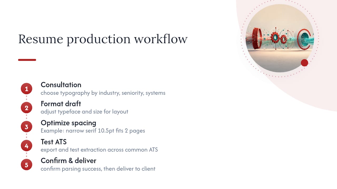
Font selection isn’t a cosmetic afterthought bolted onto a finished draft. Writers choose typography during the consultation itself, weighing industry, seniority, and the specific systems a target employer is likely to use, then format and test the document before it ever reaches the client for review.
A finance director’s resume set in a narrow serif at 10.5pt fit two decades of experience onto two pages without crowding a single section. The same content in a wider sans serif ran to three pages and diluted the impact of the leadership summary at the top.
That kind of adjustment, tightening a typeface to protect space without sacrificing legibility, comes up constantly with specialized resumes for candidates with long, dense histories. Writers also test exported files across common ATS platforms before delivery, checking that headings, bullet points, and contact details all extract cleanly as plain text.
Pro Tip: A resume that looks polished on your screen can still fail parsing if it was never tested as extracted text. Ask any professional writer to confirm this step was completed, not assumed.
What most resume advice gets backwards about fonts
Most advice treats font choice as a personality decision: pick something that “represents you.” That framing gets the priority order wrong. Your font’s first job is surviving the parser, its second job is reading cleanly to a tired recruiter, and only its third job is expressing anything about your personal brand. Chase the third goal before the first two and you risk losing the interview before a human ever opens the file.
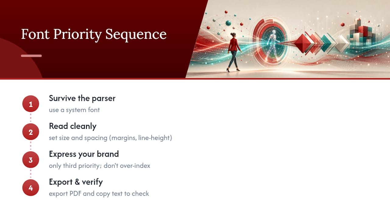
The bigger blind spot is spacing, not typeface. Job seekers agonize over Calibri versus Garamond while ignoring margins that sit at 0.3 inches or line heights stretched to 1.5. Those choices do more damage to readability than any font decision. Get the size and spacing specs right first, then treat font selection as the smaller, second-order decision it actually is.
If you take one thing from this, don’t over-index on finding a “unique” font. Prioritize a system font, a tested size, and a PDF export you’ve personally verified by copying the text back out. That sequence protects you far more reliably than any typeface will on its own.
— Professional
Get your resume font and formatting handled by a professional writer
Every rule in this guide takes time to apply correctly across a full resume, and one missed export setting can undo the rest. Some professional resume services build font selection and ATS testing directly into every writing engagement, so you’re not left guessing whether your PDF will parse the way you intend.
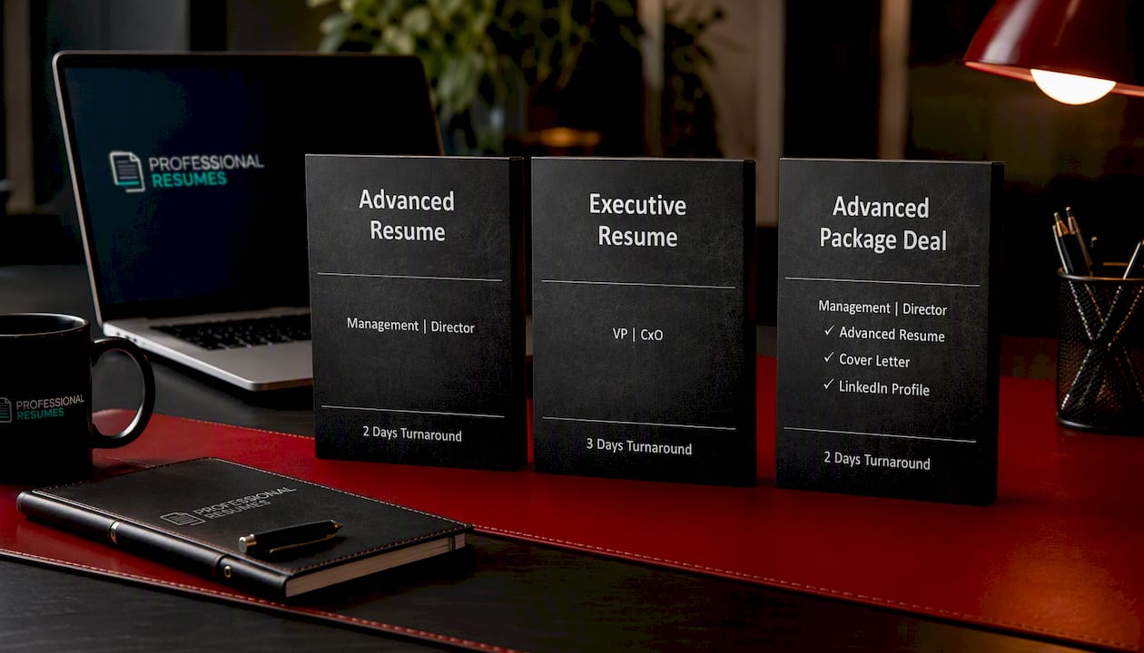
The Advanced Resume package includes a full consultation, custom writing, and ATS-safe formatting for candidates who want a document built correctly from the first draft. For senior candidates who need dense career histories condensed without losing impact, the Executive Resume service applies the same font and spacing discipline covered above, tuned for leadership-level positioning. If you also need a cover letter and LinkedIn profile brought into line with your new resume, the Advanced Package Deal bundles all three into one coordinated project.
Start by reviewing which package matches your career stage, then book your consultation to get your formatting and font choices handled before your next application goes out.
Sources
- The best resume fonts, sizes, and formatting tips (2026) | Microsoft Word Blog
- The Top 10 Best Fonts For Your Resume | Jobscan
- Good resume fonts | Indeed (Canada)