
Both fonts are safe, and neither will cost you an interview on its own. Calibri is slightly narrower and softer, which helps when you are fitting a dense career history onto two pages. Arial is slightly wider and more neutral, which suits printed copies and conservative employers. Choose one, set it at 10.5 to 12 points, and apply it consistently across your resume and cover letter.
The rest of this article explains the differences that matter in practice, what Canadian universities and government bodies say about each font, and how to decide for your own document.
TL;DR
- Calibri and Arial are both recommended by Canadian public bodies and universities for resumes and cover letters, so the decision is about fit and appearance, not acceptance.
- Calibri sets narrower and looks softer; Arial has a larger x-height and a more traditional, neutral look.
- Use 11 to 12 points for body text where space allows, never below 10, and keep headings slightly larger.
- ATS problems come from columns, graphics, headers and custom headings far more often than from font choice.
- Use the same font in your resume, cover letter and LinkedIn-facing documents so the application package looks like one piece of work.
Table of Contents
- How Calibri and Arial differ visually
- Readability on screen and in print
- What Canadian sources say
- Does the font affect ATS parsing?
- Which font size works with each
- When to choose Calibri and when to choose Arial
- Our perspective
- Keep one font across your whole application
- Need a resume formatted and written for you?
- A quick decision method
- FAQ
- Sources
How Calibri and Arial differ visually
The two typefaces belong to different design families, and you can see it in the letterforms. FontKind describes Calibri as a humanist sans-serif with subtly rounded stems and corners, which gives it a softer, more contemporary appearance. Arial is a more traditional neo-grotesque with squarer forms.
Two practical differences follow from that:
- Width. The same comparison reports that identical text sets roughly 7% narrower in Calibri than in Arial at the same point size. On a resume, that can be the difference between a last bullet that fits and one that spills onto a new page.
- Apparent size. Arial has the larger x-height, so lowercase letters look bigger at the same nominal size. A 11-point Arial can read as slightly larger than 11-point Calibri even though it is not.
HubSpot’s recruiter-oriented font guidance frames the trade-off in similar terms: Arial is practical when you need compact, highly legible text, while Calibri gives a lighter, more modern impression. It also makes the point that neither font substitutes for strong content, which is the right way to weigh the whole question.
Side-by-side summary
| Factor | Calibri | Arial |
|---|---|---|
| Style | Humanist, rounded corners, softer | Neo-grotesque, squarer, neutral |
| Width at the same size | Narrower, fits more per line | Wider, about 7% more space for the same text |
| Apparent size | Looks slightly smaller | Looks slightly larger (bigger x-height) |
| Feel to a reader | Contemporary, approachable | Traditional, widespread, formal |
| Best suited to | Dense two-page resumes, screen reading | Printed copies, conservative sectors, shorter resumes |
Readability on screen and in print
Most resumes are read first on a screen, often quickly, and sometimes printed for an interview panel. Both fonts perform well in each setting.
The Canadian RGD AccessAbility guidance on typeface selection notes that familiar typefaces such as Arial and Calibri are commonly rated among the most readable and preferred, including by people with vision or reading difficulties, and that familiarity is itself a major contributor to readability. That is an argument for not overthinking the choice: a reader who has seen a font ten thousand times processes it without effort.
The same page adds a nuance. Narrow apertures, as in Arial or Helvetica, can make letter counters look fully enclosed to some readers with a vision impairment, while wider apertures improve legibility. It describes Calibri as having much more open apertures. If accessibility for a wide range of readers is a priority, that gives Calibri a small edge on screen.
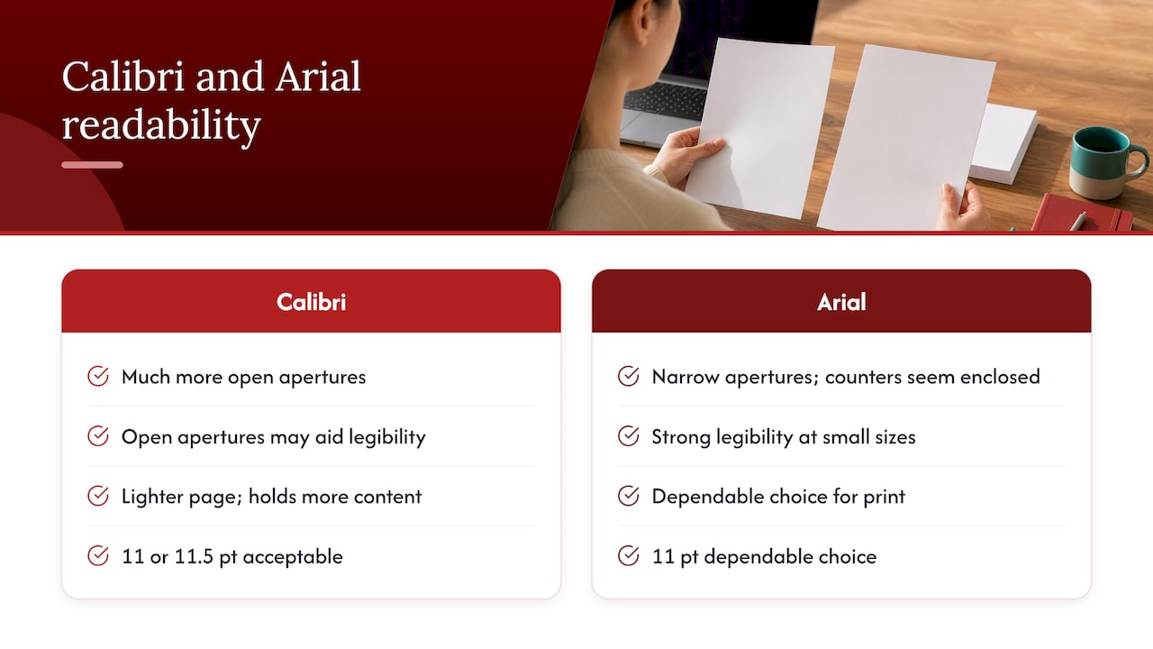
In print, HubSpot describes Arial as having strong legibility at small sizes, including on paper, though its ubiquity means it can feel less distinctive. Calibri is described as designed for legibility and lighter on the page, which can help a one-page resume hold more content. If you expect to hand a printed copy to an interview panel, Arial at 11 points is a dependable choice. Calibri at 11 or 11.5 points is equally acceptable.
What Canadian sources say
Canadian guidance does not rank one of these fonts above the other. It lists both.
- The University of Toronto Mississauga’s Career Centre formatting advice recommends a basic font such as Calibri, Times New Roman or Arial at 11 to 12 points, and advises checking any formatting requirements an employer sets.
- Alberta’s alis guidance on sending your resumé package lists both Arial and Calibri as standard fonts suitable for résumés and cover letters, whether submitted electronically or printed.
- The Ontario Public Service’s cover letter and resume guide recommends standard fonts for electronic documents, including Arial, at 10 to 12 points. That guide dates from 2015, so treat it as a statement of long-standing practice rather than a current rule.
For printed applications, alis also recommends standard fonts such as Arial or Calibri, minimal graphics, underlining and italics, and clean white or buff paper.
The pattern is consistent. Public employers and universities want a plain, familiar sans-serif. If you are applying for federal roles, see our guide to federal resumes in Canada, where content and structure matter far more than typography.
Does the font affect ATS parsing?
For these two fonts, no. Applicant tracking systems read the text in your file, not the shape of the letters. What breaks parsing is the structure around the text.
Royal Bank of Canada’s Canadian resume guidance states that many Canadian organizations use ATS software to prescreen resumes before a recruiter or hiring manager sees them. It recommends standard formatting and avoiding images, designs, charts and tables. The University of Toronto Mississauga adds that graphics can cause technical problems when a resume is scanned or opened in an incompatible program, and advises keeping key information out of document headers.
Santa Clara University’s ATS formatting advice lists Arial, Times New Roman and Calibri as common fonts that work, and recommends conventional headings such as Work Experience, Education, Skills and Certifications, because custom headings may not be parsed correctly. It is a US university, but the parsing logic it describes applies to the same software used by many Canadian employers.
In practice, spend your attention on this checklist before you debate fonts:
- Single-column layout, with no text boxes or tables holding your experience.
- Contact details in the body of the document, not the header or footer.
- Standard section headings.
- Plain bullet characters.
- A file format the employer asks for. Our note on PDF versus Word resumes explains why .docx is usually the safer default.
For a fuller treatment, read our guide to ATS-friendly resumes for Canadian job seekers.
Which font size works with each
Size matters more than the choice between these two typefaces, because an undersized resume is hard to read in either.
- Body text: 11 to 12 points is the range the University of Toronto Mississauga recommends. The Ontario Public Service allows 10 to 12.
- Floor: RBC advises against sizes below 10 on an ATS-oriented resume.
- Headings: Santa Clara University suggests 14 to 16 points for headings, with body text at 10 to 12.
Because Calibri sets narrower and looks smaller, 11 points is a sensible minimum for it, and 11.5 or 12 is comfortable. Arial looks larger at the same size, so 10.5 or 11 points usually reads well, and 12 can start to feel heavy on a dense page.
If you find yourself dropping to 10 points to fit everything, the problem is usually content, not font. Our guide to resume length for Canadian job seekers explains when two pages is justified and what to cut first. Margins and spacing also matter, and this overview of resume layout and white space shows how much a tidy page structure contributes to readability.
When to choose Calibri and when to choose Arial
Use these criteria rather than a general preference.
Choose Calibri if
- Your experience runs to two full pages and you need the extra width efficiency.
- You want a slightly warmer, more contemporary look, as in marketing, communications, technology or education.
- Your resume will mostly be read on screen.
- You are submitting your resume as a Word file and want it to match the default look of many Canadian office documents.
Choose Arial if
- You expect the resume to be printed and passed around a panel.
- You work in a conservative field such as finance, law, government or healthcare administration.
- Your resume is concise and you can afford the extra width.
- You want a font that looks neutral and unremarkable, so that the content does all the work.
One point on currency. Microsoft’s Office default moved from Calibri to Aptos in 2023, according to Wikipedia’s account of the typeface. That does not make Calibri a poor resume font. Both Canadian public guidance and the major recruiter sources above still list it, and it remains installed on nearly every machine a hiring team uses. It does mean that a resume in Calibri no longer signals a default-settings document in newer versions of Word, which is a minor point in its favour.
Our perspective
We review resumes for executives, healthcare professionals, engineers, finance and education candidates, and for people returning to work or adapting their experience to the Canadian market. In that work, font choice almost never decides an outcome. A recruiter or hiring committee forms a view from the first third of the page: the headline, the summary and the first two roles. If those show scope, results and relevance, either font carries them.
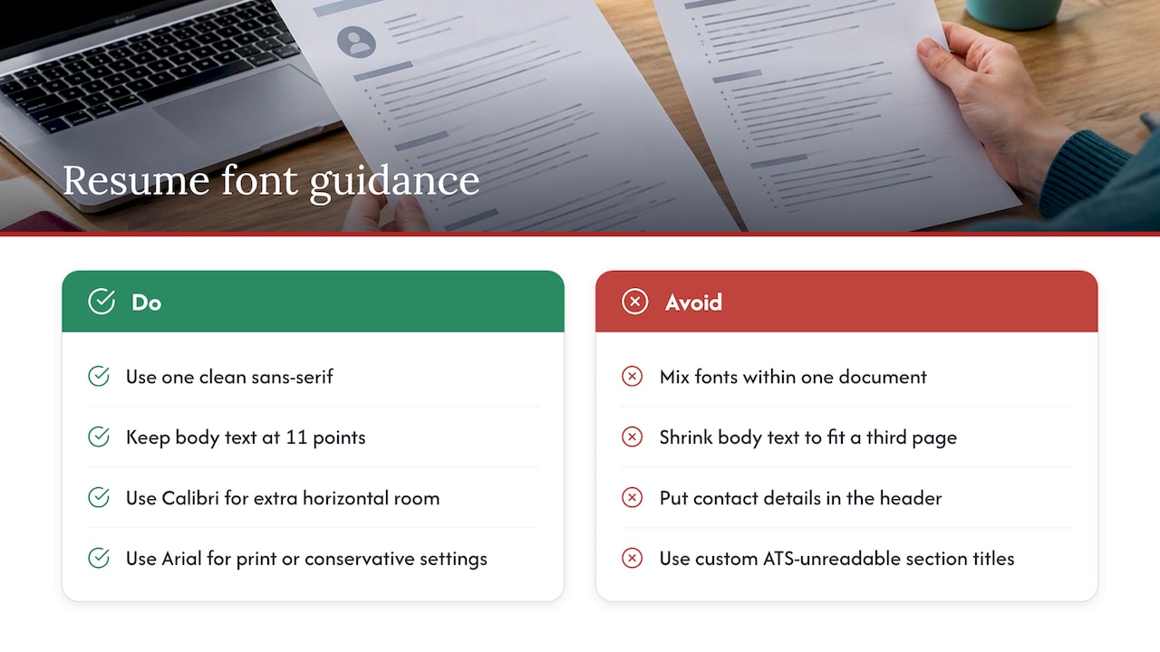
We do have a working preference. For most clients we set resumes in a single clean sans-serif at 11 points, with slightly larger headings, and we pick Calibri when a candidate’s history needs the extra horizontal room and Arial when the document will be printed or read in a conservative setting. At senior levels, where a resume is read under board-level or retained-search scrutiny, restraint matters more than expression. A page with consistent spacing, quantified outcomes and one typeface looks deliberate.
The mistakes we correct most often are not about these two fonts. They are mixed fonts within one document, body text shrunk to fit a third page, contact details in the header, and custom section titles that an ATS cannot classify. Our own guidance on resume fonts for Canadian applications and our simple resume format for Canada cover those points in detail.
— Professional
Keep one font across your whole application
The font you choose should carry through the entire package. Alberta’s alis guidance says your cover letter and résumé should match. RBC recommends standard 10 or 12 point text in Arial or Calibri for a Canadian cover letter, and advises avoiding special effects, multiple fonts and colour.
In practice:
- Use the same typeface and the same heading style in the resume and the cover letter.
- Match the contact block at the top of both documents.
- Keep colour to a minimum, or none, for anything that may be parsed or printed.
- If you write the letter in a separate file, check that the font name is identical, not merely similar.
Our guide to the Canadian cover letter shows how to build one focused paragraph that supports the resume rather than repeating it.
Need a resume formatted and written for you?
If you would rather not make these decisions alone, we write and format custom resumes with direct consultation and revisions, in ATS-friendly layouts suited to Canadian employers. Pricing is published: the Early Career Resume is $139, the Next Step Resume $189, the Advanced Resume $239 and the Executive Resume $289, each a one-off fee. You can compare them in the resume shop, or go straight to the Executive Resume if you are preparing for a senior or C-suite search. We also offer LinkedIn profile optimization so your profile and resume present the same story.
A quick decision method
If you are still undecided, run this test in under five minutes.
- Write your resume in Calibri at 11 points and note the page count.
- Switch the whole document to Arial at 11 points and compare.
- If Arial pushes you onto an extra page or leaves one orphaned line, keep Calibri.
- If both fit, print each and read them at arm’s length. Choose the one that looks cleaner to you.
- Save as .docx and, if the employer allows it, as PDF. Open both files on another device to confirm nothing shifts.
Then stop adjusting. Time spent on the quality of your achievements, keywords from the posting and quantified results will do more for your interview rate than any further typographic change. If you are weighing a bolder visual style, our comparison of a modern versus traditional resume explains what works in Canada, and our overview of resume trends shows what is changing. The Canadian resume format guide will help you choose the overall structure.
FAQ
Is Calibri or Arial better for a resume?
Neither is better in general. Canadian universities and provincial bodies list both as acceptable. Calibri sets narrower and looks softer, which helps on a crowded two-page resume, while Arial looks larger and more neutral, which suits print and conservative sectors.
Will an ATS reject my resume for using Calibri or Arial?
No. Both are standard fonts that ATS software reads without difficulty, and university career centres recommend them. Rejections and misread fields come from columns, tables, graphics, headers and unconventional section titles, so fix those first.
What font size should I use with Calibri or Arial?
Use 11 to 12 points for body text, which is what the University of Toronto Mississauga recommends, and do not go below 10. Calibri looks smaller, so 11 or more is wise. Arial often reads well at 10.5 or 11.
Should my cover letter use the same font as my resume?
Yes. Alberta’s alis guidance says the two documents should match, and RBC advises against multiple fonts in a cover letter. Matching typefaces, heading style and contact details make the application read as one package.
Is Calibri still acceptable now that Microsoft has changed its default font?
Yes. Microsoft’s default moved to Aptos in 2023, but Calibri remains widely installed and is still listed in Canadian public guidance and recruiter advice. Choose it if it suits your layout.
Sources
- FontKind: Calibri vs Arial
- HubSpot: The Best Fonts for Your Resume
- RGD AccessAbility: Typeface selection
- University of Toronto Mississauga Career Centre: Formatting Matters
- Alberta alis: How to Send Your Resumé Package in Multiple Formats
- Ontario Public Service: Writing a cover letter and resume
- RBC: Write a Canadian resume and cover letter
- Santa Clara University: Common ATS Resume Formatting Mistakes
- Wikipedia: Aptos (typeface)